Here are small customizations you can do to make your theme be better. Transformer theme and Panda theme already have a huge number of settings, we can't add every request as an option to them, that's why we need this guide. I will update this guide regularly to help you make your PrestaShop site be better.
Codes below mostly are custom css codes, put them to the Custom CSS code field in the Theme editor.
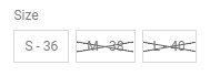
1. Change the size boxes on the product page to be round in Panda v2 and Transformer v4.
1 2 3 | .product-variants .input-radio:checked+span, .product-variants .input-radio:hover+span {line-height: 28px;} .product-variants .radio-label {border-radius: 50px; min-width: 30px; height: 30px; line-height: 30px; text-align: center;} .product-variants .color{border-radius: 50px;} |
You can alter 30 to adjust the size of size boxes.

2. Change the colors of the size boxes on the product page in Panda v2 and Transformer v4.
1 2 | .product-variants .input-radio:checked+span, .product-variants .input-radio:hover+span{border-color:#000fff;background:#fff000;color:#000fff} .product-variants .input-color:checked + span{border-color:#000fff;} |

3. Change the style of quantity box on the product page in Panda v2 and Transformer v4.
1 2 3 | .qty_wrap.qty_wrap_big .input-group-btn:first-child .btn{border-right:none;} .qty_wrap.qty_wrap_big .input-group-btn:last-child .btn{border-left:none;} .qty_wrap.qty_wrap_big .form-control{border-left:none;border-right:none;} |

4. Hide the quantity box on the product page in Panda v2 and Transformer v4.
1 | .qty_wrap.qty_wrap_big{display:none;} |
5. A circle around the cart icon in Panda v2 and Transformer v4.
If you want to have a circle around the cart icon when the "Cart icon on the header" setting in the "Shopping cart mod" module is "Large, default cart icon".
1 | .shopping_cart_style_2 .ajax_cart_bag{border: 2px solid #333333;height: 36px;line-height: 32px;width: 36px;text-align: center;border-radius: 50px;} |

6. Remove the text "Brand" which is in front brand logos in Panda v2 and Transformer v4.
1 | .product-manufacturer .pro_extra_info_label{display:none;} |

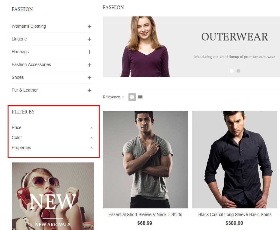
7. How to make the My account page look like the screenshot below in Panda theme v1.
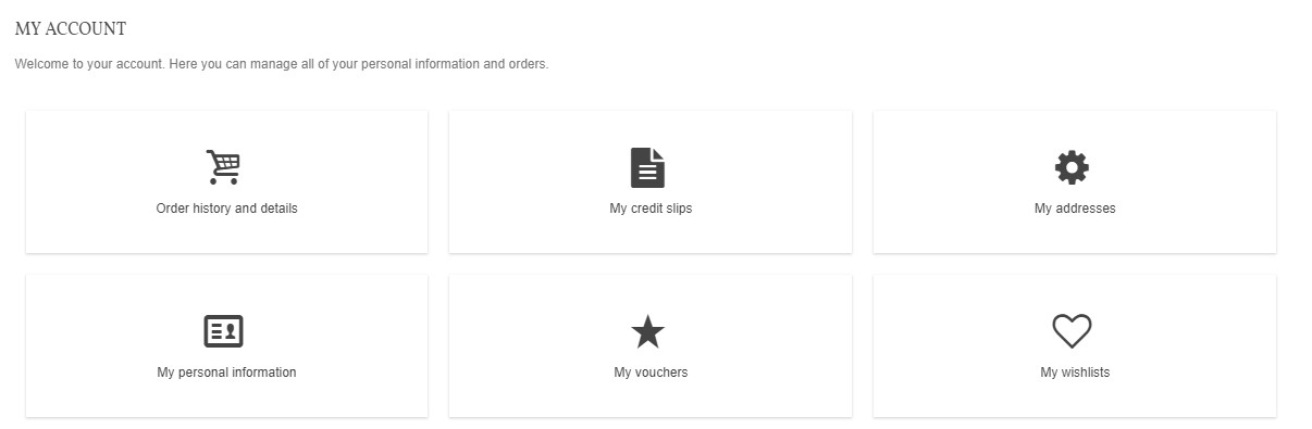
1 2 3 4 5 6 7 8 9 10 11 12 | .addresses-lists .col-xs-12{width:100%!important;} #my-account ul.myaccount-link-list li{padding:10px;width:33.333%;display:inline-block;} #my-account ul.myaccount-link-list a{background:#ffffff;display:block;border:1px sold #D5D5D5;box-shadow:0 1px 2px #d5d5d5;-webkit-box-shadow:0 1px 2px #d5d5d5;text-align:center;padding:32px 0;} #my-account ul.myaccount-link-list li .icon_wrap{background-color:transparent;display:block;height:auto;line-height:auto;} .myaccount-link-list li .icon_wrap:hover, .myaccount-link-list a:hover .icon_wrap{color:#e54d26;} #my-account ul.myaccount-link-list li .icon_wrap .icon-1x{font-size:3em;} @media (max-width: 767px) { #my-account ul.myaccount-link-list li{width:50%;} } @media only screen and (max-width: 480px) { #my-account ul.myaccount-link-list li{width:100%;} } |
8. Increase the width and height of Add to cart and Buy now buttons on the product page in Transformer theme v4 and panda theme v2.

1 | .pro_cart_block .btn-default.btn-large{padding: 0 25px;height:50px;line-height:46px;} |
To increase the width of the quantity box.
1 2 | .qty_wrap.qty_wrap_big{width: 100px;} .qty_wrap.qty_wrap_big .btn {width: 34px;} |
To increase the height of the quantity box.
1 2 | .qty_wrap.qty_wrap_big .btn {height: 50px;line-height: 48px;} .qty_wrap.qty_wrap_big .form-control{height:50px;} |
9. How to change the style of breadcrumb to look like the default one in Panda v1, Transformer theme v4 and panda template v2.
For Panda v1.
1 2 3 4 5 6 7 | #breadcrumb_wrapper{padding:6px 0;background:transparent;} .breadcrumb {display: inline-block; padding: 0 11px; border: 1px solid #d6d4d4; font-weight: bold; font-size: 12px; line-height: 24px; min-height: 6px; -moz-border-radius: 3px; -webkit-border-radius: 3px; border-radius: 3px; overflow: hidden; position: relative; background:#f6f6f6; z-index: 1; color: #777; } .breadcrumb .navigation-pipe {width: 18px; display: inline-block; margin:0; text-indent: -5000px; } .breadcrumb a {display: inline-block; background: #fff; padding: 0 15px 0 22px; margin-left: -26px; position: relative; z-index: 2; color: #333; } .breadcrumb a:after {display: inline-block; content: "."; position: absolute; right: -10px; top: 3px; width: 18px; height: 18px; background: #fff; border-right: 1px solid #d6d4d4; border-top: 1px solid #d6d4d4; border-radius: 2px; text-indent: -5000px; z-index: -1; -webkit-transform: rotate(45deg); -ms-transform: rotate(45deg); transform: rotate(45deg); } .breadcrumb a:before {display: inline-block; content: "."; position: absolute; left: -10px; top: 3px; width: 18px; height: 18px; background: transparent; border-right: 1px solid #d6d4d4; border-top: 1px solid #d6d4d4; border-radius: 2px; text-indent: -5000px; z-index: -1; -webkit-transform: rotate(45deg); -ms-transform: rotate(45deg); transform: rotate(45deg); } .breadcrumb a:hover {color: #777777; } |
For Panda v1 in RTL.
1 2 3 4 5 6 7 | #breadcrumb_wrapper{padding:6px 0;background:transparent;} .breadcrumb {display: inline-block; padding: 0 11px; border: 1px solid #d6d4d4; font-weight: bold; font-size: 12px; line-height: 24px; min-height: 6px; -moz-border-radius: 3px; -webkit-border-radius: 3px; border-radius: 3px; overflow: hidden; position: relative; background:#f6f6f6; z-index: 1; color: #777; } .breadcrumb .navigation-pipe {width: 18px; display: inline-block; margin:0; text-indent: -5000px; } .breadcrumb a {display: inline-block; background: #fff; padding: 0 22px 0 15px; margin-right: -26px; position: relative; z-index: 2; color: #333; } .breadcrumb a:after {display: inline-block; content: "."; position: absolute; left: -10px; top: 3px; width: 18px; height: 18px; background: #fff; border-right: 1px solid #d6d4d4; border-top: 1px solid #d6d4d4; border-radius: 2px; text-indent: -5000px; z-index: -1; -webkit-transform: rotate(225deg); -ms-transform: rotate(225deg); transform: rotate(225deg); } .breadcrumb a:before {display: inline-block; content: "."; position: absolute; right: -10px; top: 3px; width: 18px; height: 18px; background: transparent; border-right: 1px solid #d6d4d4; border-top: 1px solid #d6d4d4; border-radius: 2px; text-indent: -5000px; z-index: -1; -webkit-transform: rotate(225deg); -ms-transform: rotate(225deg); transform: rotate(225deg); } .breadcrumb a:hover {color: #777777; } |
For Transformer theme v4 and panda template v2
1 2 3 4 5 6 7 8 | #breadcrumb_wrapper{padding:6px 0;background:transparent;} .breadcrumb_nav {display: inline-block; padding-left: 11px; border: 1px solid #d6d4d4; font-weight: bold; font-size: 12px; line-height: 24px; min-height: 6px; -moz-border-radius: 3px; -webkit-border-radius: 3px; border-radius: 3px; overflow: hidden; position: relative; background:#f6f6f6; z-index: 1; color: #777; } .breadcrumb_nav .navigation-pipe {width: 18px; display: inline-block; margin:0; text-indent: -5000px; } .breadcrumb_nav a,.breadcrumb_nav li > span {display: inline-block; background: #fff; padding: 0 15px 0 22px; margin-left: -26px; position: relative; z-index: 2; color: #333; } .breadcrumb_nav a:after,.breadcrumb_nav li > span:after {display: inline-block; content: "."; position: absolute; right: -10px; top: 3px; width: 18px; height: 18px; background: #fff; border-right: 1px solid #d6d4d4; border-top: 1px solid #d6d4d4; border-radius: 2px; text-indent: -5000px; z-index: -1; -webkit-transform: rotate(45deg); -ms-transform: rotate(45deg); transform: rotate(45deg); } .breadcrumb_nav a:before,.breadcrumb_nav li > span:before {display: inline-block; content: "."; position: absolute; left: -10px; top: 3px; width: 18px; height: 18px; background: transparent; border-right: 1px solid #d6d4d4; border-top: 1px solid #d6d4d4; border-radius: 2px; text-indent: -5000px; z-index: -1; -webkit-transform: rotate(45deg); -ms-transform: rotate(45deg); transform: rotate(45deg); } .breadcrumb_nav a:hover {color: #777777; } .breadcrumb_nav:last-child a:after, .breadcrumb_nav:last-child span:after{display:none;} |
10. How to make product descriptions be even to make product grids be even too in Panda v2 and Transformer v4
1 2 3 | .pro_second_box .product-desc{min-height:140px;} @media (min-width:768px) and (max-width:991px){ {.pro_second_box .product-desc{min-height:150px;}} @media (max-width: 767px) {.pro_second_box .product-desc{min-height:160px;}} |
11. Remove the border around brands in the Brand slider module in Panda v2 and Transformer v4

1 | .brands_slider_item{border:none;} |
12. Improve ajax search result to show by weights in Pretashop1.7
It requires to modify /classes/Search.php file, change
1 2 3 4 5 6 7 8 9 10 11 12 | $score = ''; if (is_array($score_array) && !empty($score_array)) { $score = ',( SELECT SUM(weight) FROM '._DB_PREFIX_.'search_word sw LEFT JOIN '._DB_PREFIX_.'search_index si ON sw.id_word = si.id_word WHERE sw.id_lang = '.(int)$id_lang.' AND sw.id_shop = '.$context->shop->id.' AND si.id_product = p.id_product AND ('.implode(' OR ', $score_array).') ) position'; } |
To
1 2 3 4 5 6 7 8 9 10 11 12 13 14 15 16 17 18 | $score = ''; $field = 'position'; if (Tools::getValue('is_ajax_search')) { $field = 'pos'; $order_by = 'pos'; $order_way = 'desc'; } if (is_array($score_array) && !empty($score_array)) { $score = ',( SELECT SUM(weight) FROM '._DB_PREFIX_.'search_word sw LEFT JOIN '._DB_PREFIX_.'search_index si ON sw.id_word = si.id_word WHERE sw.id_lang = '.(int)$id_lang.' AND sw.id_shop = '.$context->shop->id.' AND si.id_product = p.id_product AND ('.implode(' OR ', $score_array).') ) '.$field; } |

Change product name weights to 3000 on Search settings page:

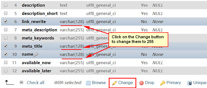
13. Increase the allow length of product name from 128 to 255 in Pretashop1.7
For various reason, you may want to use long product names, the default length is 128, to increase the length you need to edit 2 files and one table.
1. Edit the /classes/Product.php file to increase the length of meta_title, link_rewrite and name, see picture below.

2. Edit the \src\PrestaShopBundle\Form\Admin\Product\ProductInformation.php file.

3. Edit the ps_product_lang table by using phpmyadmin to increase the length of meta_title, link_rewrite and name.
14. Change the background color of zoom feature in Panda v2 and Transformer v4
By default the background color of zoom feature is white. If the background color of your site isn't white and your product images are in PNG format with transparent background, then you may want to change the background color of zoom feature.
1 | .easyzoom-flyout{background:#000000;} |
15. Make product tab heading be full width in Panda v2 and Transformer v4
1 | .product_info_tabs .nav-tabs .nav-item{-webkit-box-flex:1;box-flex:1;-moz-flex:1;-ms-flex:1;flex:1} |
16. Increase the width of popup shopping cart in Panda v2 and Transformer v4
1 | @media (min-width: 576px){#blockcart-modal .modal-dialog {max-width: 600px;}} |
17. Make carrier rows be clickable in Panda v1 and Transformer v3
1 2 3 4 5 6 7 8 9 | $(document).ready(function(){ $(document).on('click', ".delivery_options .delivery_option", function(e){ var _ta = $(e.target); if(!_ta.is(':radio') && !_ta.hasClass('radio')){ $(".delivery_options .checked").removeClass("checked"); $(this).find(".radio span").addClass("checked").find(":radio").prop("checked", true).trigger('change'); } }); }); |
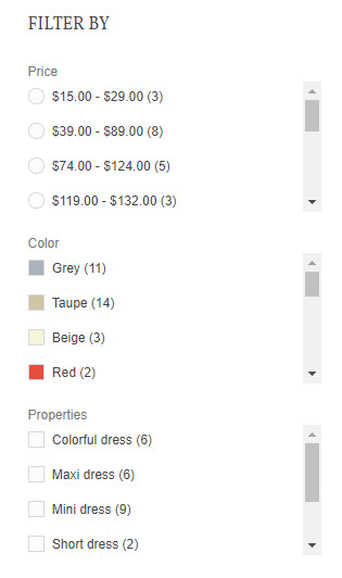
18. Display filters in an accordion on desktop version in Panda v2 and Transformer v4
1 2 3 4 | .facet .collapse.show{display: block;} .facet .collapse{display: none;} .facet-title-mobile.hidden-lg-up{display: block!important;font-size:14px;color:#444; } .facet-title.hidden-md-down {display: none!important;} |
19. Highlight the current category on the "Category tree links" section in Panda v2 and Transformer v4
1 | .category-sub-menu .current_cate>.acc_header a{color:#E54D26;} |
20. Change the white background of your product images to gray in Panda v1, v2 and Transformer theme v3, v4.
If your product images are all in pure white background, you can use this custom css code to make them in gray background.
1 | .product_img_link, .product_image,.pro_gallery_item,.pro_gallery_thumb{-webkit-filter:brightness(0.96);filter: brightness(0.96);} |
Before.

After.

21. Auto update copyright year
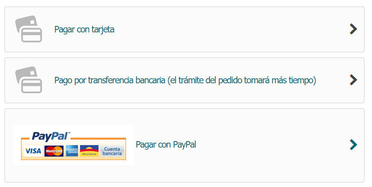
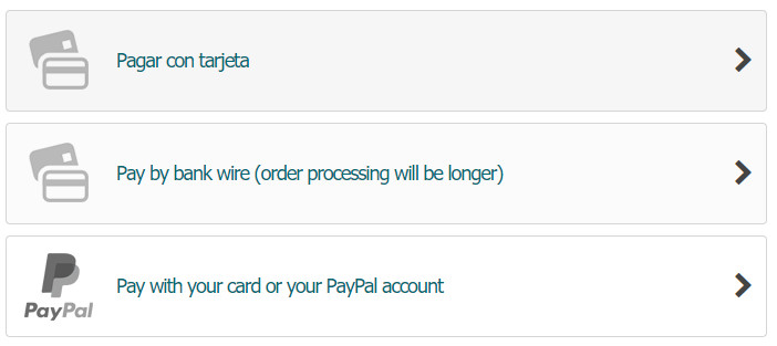
22. Customize the layout of payment methods in Panda v2 and Transformer v4.
1 2 3 | .checkout-step .payment-options .payment-option, .checkout-step .payment-options .payment-option label{display: -webkit-box; display: -moz-box; display: box; display: -webkit-flex; display: -moz-flex; display: -ms-flexbox; -js-display: flex; display: flex; -webkit-box-align: center; -moz-box-align: center; box-align: center; -webkit-align-items: center; -moz-align-items: center; -ms-align-items: center; -o-align-items: center; align-items: center; -ms-flex-align: center; width: 100%; -ms-flex-pack:justify;-webkit-box-orient:horizontal;-webkit-box-direction:normal;-ms-flex-flow:row nowrap;flex-flow:row nowrap;} .checkout-step .payment-options .payment-option {border: 1px solid #D8D8D8; border-radius: 5px; background-color:#FBFBFB; padding-left:8px; } .checkout-step .payment-options .payment-option label{padding: 8px 6px; cursor: pointer; -webkit-box-flex: 1; -moz-box-flex: 1; box-flex: 1; -webkit-flex: 1; -moz-flex: 1; -ms-flex: 1; flex: 1; -webkit-box-pack:justify;box-pack:justify;-moz-justify-content:space-between;-ms-justify-content:space-between;-o-justify-content:space-between;justify-content:space-between;-ms-flex-pack:justify;} |

23. Add scroll bar for filters in Panda v2 and Transformer v4.
1 2 | #search_filters .facet ul {max-height: 220px;overflow-x: auto;} #search_filters .facet{margin-bottom: 20px;} |
24. Make Paypal button to be similar with other payment buttons in Panda v1 and Transformer v3.
This is for the Paypal module 3.x.x. created by PrestaShop.
1) Add this custom css code to the Custom css code field.
1 2 | p.payment_module.paypal a{background:#fbfbfb;padding-top:10px;padding-bottom:10px;} p.payment_module.paypal a:after{display: block; content: "\e803"; position: absolute; right: 15px; margin-top: -11px; top: 50%; font-family: "fontello"; font-size: 25px; height: 22px; width: 14px;color: #444444;} |
2) Remove col-md-6 from the /modules/paypal/views/templates/hook/express_checkout_payment.tpl file.
After doing the above two steps, you will get this
If you find the image on the paypay checkout button doesn't show out, then you need to download the file logos.xml form https://github.com/PrestaShop/paypal to upgrade your one.
3) Upload this picture to the /upload/ folder of your site.
4) Add one more piece of custom css code.
1 2 | p.payment_module.paypal a img{display:none;} p.payment_module.paypal a{padding-left:99px!important;background:url(//your-domain/upload/paypal-logo-64.png) no-repeat 15px center;padding-top:33px;padding-bottom:33px;} |
25. Expanding a category’s subcategories by clicking on its name in the category tree module in Panda v2 and Transformer v4.
1 2 | .block-categories .acc_box .acc_header{position:relative;} .block-categories .acc_box .acc_icon{position:absolute;width: auto;margin: 0;left: 0;right: 0;text-align:right;} |
25. Change the colors of quantity box in Panda v2 and Transformer v4.
1 2 | .bootstrap-touchspin .form-control{background:#444444;color:#ffffff;border-color:#000000} .bootstrap-touchspin .btn-touchspin{background:#444444;color:#ffffff;border-color:#000000} |
26. X sign for unavailable attributes in Panda v2 and Transformer v4.
Put this css code to the "Custom css code" field in the Theme editor moudle. This works for versions later than Transformer v4.3.2 and Panda theme v2.4.2
1 2 3 4 5 6 | .st_unavailable_combination .input-color, .st_unavailable_combination .input-radio{cursor: default;} .st_unavailable_combination .radio-label,.st_unavailable_combination .color{position:relative;display:inline-block;} .st_unavailable_combination .radio-label::before,.st_unavailable_combination .color::before{content:"";width:100%;position:absolute;right:0;top:50%} .st_unavailable_combination .radio-label::after,.st_unavailable_combination .color::after{content:"";width:100%;position:absolute;right:0;top:50%} .st_unavailable_combination .radio-label::before,.st_unavailable_combination .color::before{border-bottom:1px solid #686464;-webkit-transform:skewY(-10deg);transform:skewY(-10deg)} .st_unavailable_combination .radio-label::after,.st_unavailable_combination .color::after{border-bottom:1px solid #686464;-webkit-transform:skewY(10deg);transform:skewY(10deg)} |
If you want them to be clickable, add one more line.
1 | .st_unavailable_combination .input-color, .st_unavailable_combination .input-radio{z-index:1;} |
In some rare cases, you need to edit the \themes\yourtheme\templates\catalog\_partials\product-variants.tpl file to make them be unclickable, search for {if $group_attribute.selected} checked="checked"{/if} there are two of them, add this code right after them.
1 | {if !$is_available} disabled="disabled" {/if} |
27. To make filters be collapsed by default in Panda v1 and Transformer v3.
Add 3 small pieces of code to the /themes/yourtheme/modules/blocklayered/blocklayered.tpl file.
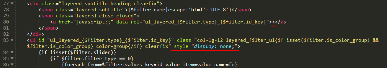
Here are the codes you need.
1 2 3 | closed < style="display: none;" |

28. If your multi menus are long, you can use this code to make them show 2 submenu items per row in Panda v2 and Transformer v4.
1 2 3 4 5 6 7 | #st_menu_31 .stmenu_multi_level li.ml_level_2{width:280px;} #st_menu_31 .stmenu_multi_level li.ml_level_2 p{margin-bottom:0;} #st_menu_31 .stmenu_multi_level li.ml_level_2 a{border-bottom:none;} #st_menu_multi_level_31{width:500px;} #st_menu_multi_level_31 li{display:inline-block;} #st_menu_multi_level_31 .is_parent_icon{display:none;} #st_menu_multi_level_31 .mu_level_2{left:60%;top:20px;} |

29. Show "To be determined" instead of "Free shipping".
Edit the \src\Adapter\Presenter\Cart\CartPresenter.php file, if you can't find it, then look for the \src\Adapter\Cart\CartPresenter.php file.
Replace the second
1 | $this->translator->trans('Free', array(), 'Shop.Theme.Checkout') |
With
1 | ($cart->id_address_delivery ? $this->translator->trans('Free', array(), 'Shop.Theme.Checkout') : $this->translator->trans('To be determined', array(), 'Shop.Theme.Checkout')) |
30. Another way to show "Determined by delivery address" instead of "Free shipping".
Modify the following files:
/themes/theme-name/templates/checkout/_partials/cart-detailed-totals.tpl
/themes/theme-name/templates/checkout/_partials/cart-summary.tpl
/modules/stshoppincart/views/templates/hook/stshoppingcart-list.tpl
Change
1 | {$subtotal.value} |
To
1 2 3 4 5 | {if $subtotal.type == 'shipping' && !$customer.is_logged} {l s='Determined by delivery address' d='Shop.Theme.Theme-name'} {else} {$subtotal.value} {/if} |
And modify the /modules/stshoppingcart/views/templates/hook/modal.tpl file
Change
1 | {$cart.subtotals.shipping.value} |
To
1 2 3 4 5 | {if !$customer.is_logged} {l s='Determined by delivery address' d='Shop.Theme.Theme-name'} {else} {$cart.subtotals.shipping.value} {/if} |
31. How to make product grids be even in Panda v2 and Transformer v4
Put this custom css code to the Theme editor module.
1 2 3 | .pro_second_box{min-height:210px;} @media (min-width:768px) and (max-width:991px){.pro_second_box{min-height:220px;}} @media (max-width: 767px) {.pro_second_box{min-height:230px;}} |
That is useful when you have shadows around product grids, you can create new codes base on it to set different heights for different blocks.
32. Another of displaying tabs on mobile
Put this custom css code to the Theme editor module.
1 2 3 4 5 6 7 8 | @media only screen and (max-width: 991px){ .product_info_tabs .nav-tabs{display:flex;-webkit-box-orient:vertical;-ms-flex-flow:column nowrap;flex-flow:column nowrap;} .product_info_tabs .nav-tabs .nav-item{margin-bottom:4px;} .product_info_tabs .mobile_tab_title{display:none;} .product_info_tabs .tab-pane .tab-pane-body{display:block;} .product_info_tabs .tab-pane{display:none;} .product_info_tabs .tab-pane.active{display:block;} } |

33. Multi-level accordion in Panda v2 and Transformer v4
1 2 3 4 5 6 7 8 9 10 11 12 13 14 15 16 17 18 19 20 21 22 23 24 25 26 27 28 29 30 | <div class="mobile_nav_box"> <ul class="mo_mu_level_0"> <li class="mo_ml_level_0 "> <div class="menu_a_wrap"> <a href="#" class="mo_ma_level_0">Home</a> </div> </li> <li class="mo_ml_level_0 "> <div class="menu_a_wrap"> <a href="#" class="mo_ma_level_0">Fashion</a> <span class="opener"><i class="fto-plus-2 plus_sign"></i><i class="fto-minus minus_sign"></i></span> </div> <ul class="mo_sub_ul" style="display: none;"> <li class="mo_sub_li"> <div class="menu_a_wrap"> <a href="#" class="mo_sub_a">Women's Clothing</a> <span class="opener"><i class="fto-plus-2 plus_sign"></i><i class="fto-minus minus_sign"></i></span> </div> <ul class="mo_sub_ul" style="display: none;"> <li class="mo_sub_li"> <div class="menu_a_wrap"> <a href="#" class="mo_sub_a ">Leggings</a> </div> </li> </ul> </li> </ul> </li> </ul> </div> |

34. See different colors for important call-to-action buttons in Panda v2 and Transformer v4
This is for the "Process to checkout" button on the Shopping cart page.
1 2 | .cart-detailed-actions .btn-default {color: #ff0000;background: #0000ff;border-color: #0000ff;} .cart-detailed-actions .btn-default:hover {color: #ff0000;background: #00ffff;border-color: #00ffff;} |
This is for the "Sign in" button on the Login page.
1 2 | #login_form_block .form-footer .btn-primary {color: #ff0000;background: #0000ff;border-color: #0000ff;} #login_form_block .form-footer .btn-primary:hover {color: #ff0000;background: #00ffff;border-color: #00ffff;} |
This is for the "Create an account" button on the Login page.
1 2 | #create_account_block .form-footer .btn-primary {color: #00ff00;background: #ff0000;border-color: #ff0000;} #create_account_block .form-footer .btn-primary:hover {color: #00ff00;background: #000fff;border-color: #000fff;} |

35. How to use lazy loading features for images in product descriptions, custom content blocks and blog posts in Panda v2 and Transformer v4
For example you have an image like this.
1 | <img src="//www.yourdomain.com/img/cms/1.jpg" /> |
You just need to add a classname to it and change src to data-src, like this
1 | <img class="cate_pro_lazy" data-src="//www.yourdomain.com/img/cms/1.jpg" /> |
36. Force a amount discount to be displayed as a percent discount in Panda v2 and Transformer v4.
For example, if you set a $10 discount for a $60 product, with this modification a "17%" sticker will show out on the front office instead of "-$10".
Replace all this code in the \themes\yourthemename\templates\catalog\_partials\miniatures\sticker.tpl file
1 | -{$product.discount_to_display} |
With
1 | {round(($product.regular_price_amount-$product.price_amount)/$product.regular_price_amount*100)}% |
37. Highlight the current menu item by adding a gray overlay below in Panda v2, Panda v1, Transformer v3 and Transformer v4.
Put this custom css code to the Theme editor module.
1 2 | .st_mega_menu .stmenu_sub{-webkit-box-shadow:0 0 0 2000px rgba(0,0,0,0.1);box-shadow:0 0 0 2000px rgba(0,0,0,0.1);} #st_mega_menu_wrap .ml_level_0.current .ma_level_0, #st_mega_menu_wrap .ma_level_0:hover{background:#fff;} |
Another way is to put a overlay for area which is under the menu, here is the code for that.
1 2 | .st_mega_menu .stmenu_sub{-webkit-box-shadow:0 1000px 0 1000px rgba(0,0,0,0.1);box-shadow:0 1000px 0 1000px rgba(0,0,0,0.1);} #st_mega_menu_wrap .ml_level_0.current .ma_level_0, #st_mega_menu_wrap .ma_level_0:hover{background:#fff;} |

38. Center the contact us page in Panda v2, Transformer v4.
The default layout of the contact us page is Left-right, you can use this code to have a centered top-bottom layout.
1 2 | body#contact .page-content .row{-webkit-flex-flow: column nowrap; -webkit-box-align: center; -moz-box-align: center; box-align: center; -webkit-align-items: center; -moz-align-items: center; -ms-align-items: center; -o-align-items: center; align-items: center; -ms-flex-align: center; } body#contact .page-content .row .col-md-6:first-child{-webkit-box-ordinal-group:3;order:2;-ms-flex-order:2} |
39. Make the cart button be fullwidth on the same line as Quantity in Panda v2, Transformer v4.
Use this custom css code.
1 2 | .pro_cart_block .product-quantity{display: -webkit-box; display: -moz-box; display: box; display: -webkit-flex; display: -moz-flex; display: -ms-flexbox; -js-display: flex; display: flex; -webkit-box-align: center; -moz-box-align: center; box-align: center; -webkit-align-items: center; -moz-align-items: center; -ms-align-items: center; -o-align-items: center; align-items: center; -ms-flex-align: center; width: 100%; -ms-flex-pack:justify;-webkit-box-orient:horizontal;-webkit-box-direction:normal;-ms-flex-flow:row nowrap;flex-flow:row nowrap} .pro_cart_block .product-quantity .add{-webkit-box-flex: 1; -moz-box-flex: 1; box-flex: 1; -webkit-flex: 1; -moz-flex: 1; -ms-flex: 1; flex: 1;} |
40. Make the add-to-cart button have a gradient background in Panda v2, Transformer v4.
Use this custom css code.
1 | .pro_cart_block .add .btn-default{ background: rgba(30,187,240,0.85); background: -webkit-linear-gradient(135deg,rgba(30,187,240,0.85) 30%,rgba(57,223,170,0.85) 100%); background: linear-gradient(135deg,rgba(30,187,240,0.85) 30%,rgba(57,223,170,0.85) 100%);} |

You can change the deg settings to like 0deg, 90deg.
41. Force the background to extend to view point height on short pages in Panda v2, Transformer v4.
Use this custom css code.
1 | #body_wrapper{min-height: 100vh;} |
42. Don't show the To-top button at the top in Panda v2 and Transformer v4.
Show the to-top button when the page is scrolled down for a little.
1. Put this code to the custom css code field.
1 2 | .to_top_wrap{display:none;} .to_top_wrap.to_top_show{display:block;} |
2. Put this code to the custom JS code field.
1 2 3 | $('#body_wrapper').waypoint(function (direction) { $('.to_top_wrap').toggleClass('to_top_show', direction == 'down'); }, {offset: '-50%'}); |
43. Adjust the style of email subscription field in Panda v2 and Transformer v4.
1 2 3 4 | .st_news_letter_box .st_news_letter_form_inner{display: block;margin: 0 auto;max-width: 400px;} .st_news_letter_box .input-group-with-border{border:none;} .st_news_letter_box .st_news_letter_input{border:1px solid #444;margin-right:6px;} .st_news_letter_box .st_news_letter_submit{background:#444;color:#fff;opacity:1;padding-left:20px;padding-right:20px;} |

44. Adjust the style of pagination in Panda v2 and Transformer v4.
You can change colors in the "PAGINATION" section under the "Colors" tab in the Theme editor module.
1 | .page-link{margin:0 4px;padding:0;min-width:40px;height:40px;line-height:40px;text-align:center;display:inline-block;border:1px solid #666;border-radius:.25rem;} |

44.1. Center the pagination in Panda v2 and Transformer v4.
1 2 | .bottom_pagination.flex_box {-webkit-flex-flow: column nowrap;;-moz-flex-flow: column nowrap;flex-flow:column nowrap;} .bottom_pagination .product_count{margin-bottom:12px;} |

45. Full screen menu on mobile in Panda v2 and Transformer v4.
1. Set the "Sidebar transition" setting to "Slide in on top" in the "Sidebar and mobile header bar" module.
2. Put this code to the custom css code field.
1 2 | #side_stmobilemenu {right: 0!important;width: auto;border-right: 0;} #side_stmobilemenu .close_right_side .fto-angle-double-left:before {content: "\E849";} |

46. Open a mobile menu's submenus by clicking on the menu's name in Panda v2 and Transformer v4.
1 | #st_mobile_menu .opener{z-index:3;} |
47. To have a text slider in constant speed in Panda v2 and Transformer v4.
1) Use the Advanced custom content module to create a text slider.
2) Config it as what shows on the screenhost.
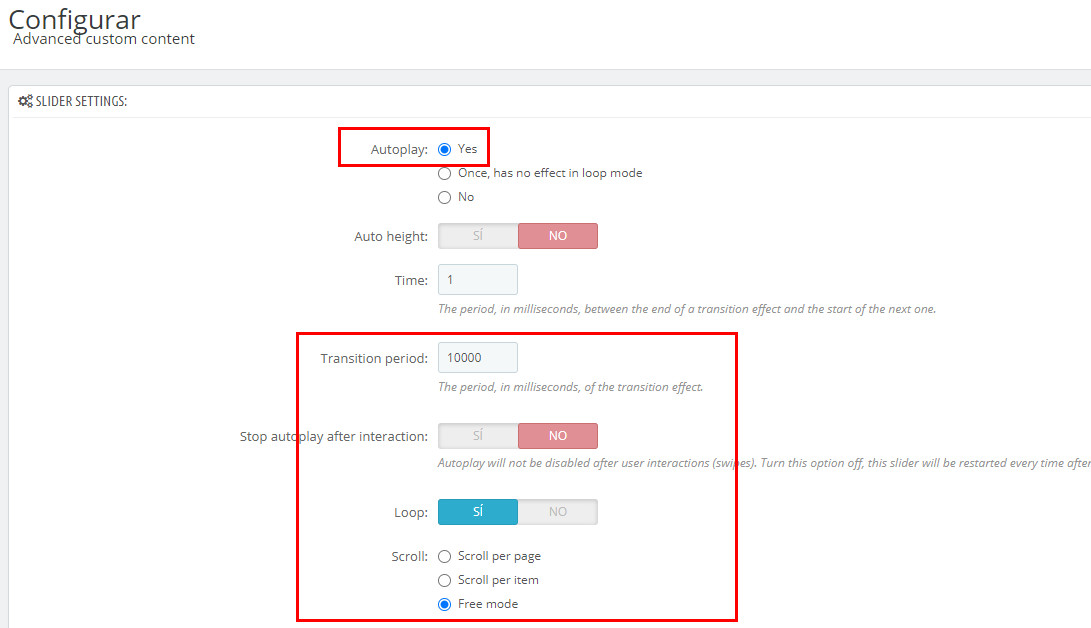
3) Add this code to the custom css code field in the Theme editor module.
1 | .swiper-container-free-mode>.swiper-wrapper{transition-timing-function: linear;} |
48. Make the sidebar be at the bottom in Panda v2 and Transformer v4.
Use this css to make the sidebar be at the bottom of the window on desktop, like how it's displayed on mobile.
1 2 3 4 5 6 | .st-menu{bottom:50px} body#checkout .st-menu{bottom:0} #sidebar_box{position:fixed;z-index:110;bottom:0;top:auto;right:0;left:0;width:100%} #sidebar_box .rightbar_wrap a.icon_wrap{border:none;display:block;width:auto;text-align:center;height:50px;padding:6px 0} #leftbar,#rightbar{-webkit-box-orient:horizontal;-webkit-box-direction:normal;-ms-flex-flow:row nowrap;flex-flow:row nowrap;position:static;bottom:auto;top:auto;right:auto;left:auto;border-right:none;border-bottom:none;border-left:none} .icon_wrap .amount_circle{right:auto;left:50%} |
49. Center align carriers in Panda v2 and Transformer v4.
Use this css code to center align carriers on the checkout page.
1 | .delivery-option.flex_container, .delivery-option .row.carrier{-webkit-box-align: center; -moz-box-align: center; box-align: center; -webkit-align-items: center; -moz-align-items: center; -ms-align-items: center; -o-align-items: center; align-items: center; -ms-flex-align: center;} |
50. Use slide-in sidebar menu on the desktop in Panda v2 and Transformer v4.
1. Remove the menu from the desktop version by removing it from the hook where it's hooked.
2. Add this button to show the slide-in menu. The code can be added via the "Advanced custom content" module or the Easybuilder module.
For the stmegamenu module.
1 | <a href="javascript:;" class="rightbar_tri icon_wrap with_text" data-name="side_stmobilemenu" data-direction="open_bar_left" rel="nofollow" title="Menu"><i class="fto-menu-2"></i><span class="icon_text">Menu</span></a> |
For the Easymenu module. NOTE you are unable to edit the easymenu items if they get removed on the desktop, so finish setting up on the desktop, and then apply the customization.
1 | <a href="javascript:;" class="rightbar_tri icon_wrap with_text" data-name="side_steasymenu" data-direction="open_bar_left" rel="nofollow" title="Menu"><i class="fto-menu-2"></i><span class="icon_text">Menu</span></a> |
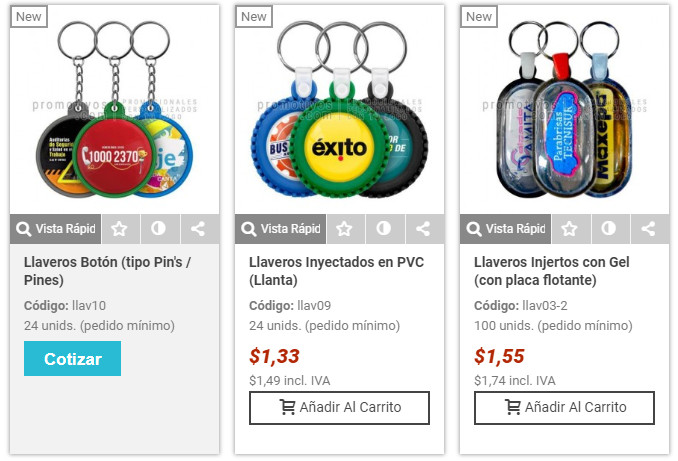
51. Display product information on the product image showing out when mouse over in Panda v2 and Transformer v4.
1 2 3 4 5 | .pro_outer_box{position:relative;} @media (min-width: 992px) { .products_sldier_swiper .pro_outer_box .pro_second_box, .product_list.grid .pro_outer_box .pro_second_box{position:absolute;left:0;right:0;bottom:0;z-index:2;display:none;} .products_sldier_swiper .pro_outer_box:hover .pro_second_box, .product_list.grid .pro_outer_box:hover .pro_second_box{display:block;background:rgba(255,255,255,0.2);} } |


how to show top right corner at place of SALE text to percentage number on special product list module
Hi Jonny.
Unfortunately, customization 51 also affects the blog. is it possible to turn this setting off for the blog?
Best regards MK.
Hi,
Yes, please contact us via the "Contact us" page, I will give you another CSS code.
Best regards.
Hello:
In customization number 44, how can I set a bigger sizes of the numbers inside the squares of the pagination?
And the size of "Displaying 1-16 of 87 item(s)" ?
Hi,
Please contact us via the support forum or the contact us page, we will help you to figure it out.
Best regards.
Jonny have a small customization for people that have allot of attributes
Go: themes\transformer\templates\catalog\product\product-first.tpl
Find line 26 and delete it:
{if $sttheme.product_name_at_top==1 || ($sttheme.product_name_at_top==2 && $sttheme.is_mobile_device)}{include file='catalog/_partials/product-name.tpl'}{/if}
##################################################################################
Find line 56 and delete it:
##################################################################################
Find line 59:
{if !$sttheme.product_name_at_top}{include file='catalog/_partials/product-name.tpl'}{/if}
And replace with:
{block name='page_title'}{$product.name}{/block}
{if ($sttheme.show_brand_logo == 4 || $sttheme.show_brand_logo == 5) && isset($product_manufacturer->id)}
{include file='catalog/_partials/miniatures/product-brand.tpl'}
{/if}
{foreach $product.extraContent as $extra}
{if $extra.moduleName == 'stproductlinknav' && ($extra.content.prev || $extra.content.next)}
{foreach $extra.content as $nav => $nav_product}
{if $nav_product}
{/if}
{/foreach}
{/if}
{if $extra.moduleName=='stvideo'}
{include file="module:stvideo/views/templates/hook/stvideo_link.tpl" stvideos=$extra.content video_position=array(10)}
{/if}
{/foreach}
{hook h='displayProductNameRight'}
##################################################################################
Find line 101 and delete it:
{if !$sttheme.product_buy}{include file='catalog/_partials/product-buy.tpl'}{/if}
##################################################################################
Find line 157 and delete it:
##################################################################################
Find line 195:
{if $sttheme.pro_secondary_column_md}
And before this line add:
{if !$sttheme.product_buy}{include file='catalog/_partials/product-buy.tpl'}{/if}
Some code cutoff in line 59:
After
{hook h='displayProductNameRight'}
Should be:
But don't know why it have been cut off.
Hmm You can delete the post because code cutting off so its not going to work if You interested i can send it somewhere else.
Please send me your code to hellolee@gmail.com I will take your code if other people may need it.
43. Adjust the style of pagination in Panda v2 and Transformer v4.
Good modification. But, in large catalogs displayed incorrectly in the top row.
After product grid, everything is good:
https://prnt.sc/t7daav
Before product grid, not good:
https://prnt.sc/t7dai7
I've corrected the code by replacing width with min-width. Thanks for your reporting.
Perfectly!
And finally I want to put a search field at the top of the site similar to the one used in this example: https://www.indian.com.uy/
Thank you very very much
Daniel
I was forgetting to mention that I use PS 1.6, Thanks
Another configuration that I want to do is: in the previous site is:
That the colors (attributes) appear in the products view in the categories and that they change the photo corresponding to the color when clicking (on the colors) without having to enter the product sheet. Example: https://allie.com.uy/vestimenta/abrigos.html
Thank you very much
Daniel
I was forgetting to mention that I use PS 1.6, Thanks
We have a module for that, but it's for 1.7 https://www.sunnytoo.com/product/change-product-images-click-color-variants-module-prestashop-1-7
I guess there are similar modules on the internet for 1.6, do some searches.
Hola, Jonny!!
Thanks for very valious tips!! 😉
You are the best, man!!!
About item 7 of your tips, say-me:
How to make the My account page look like the screenshot below in TRANSFORMER v4??
Thanks in advance for your attention!
Thanks ,used a few on my Panda 1
Hello Jonny, I would like to put a space in the text of the pop-up dialog box when adding a product to the cart, because the text is pasted.
example:
Total de productos:213.000,00 COP
Envío total:Gratis (Bajo condiciones)
IVA incluido:34.008,40 COP
Total:213.000,00 COP (IVA inc.)
Do you want add a space after every : sign? What's the version of your theme.
Hi!
Point 7 for theme transformer, I removed the left column. Maybe someone needs change the name of some icons. And the widths are for max width 1200px. I hope it can help someone.
a.landing-link, a.identity-link, a.addresses-link, a.history-link, a.order-slips-link, a.discounts-link, a.love-link, a.lnk_stproductcomments, a.lnk_psgdpr{display:block;border:2px solid black;text-align:center;padding:17px 0;}
i.fto-cog.mar_r4.fs_lg, i.fto-vcard-1.mar_r4.fs_lg, i.fto-location-2.mar_r4.fs_lg, i.fto-calendar-1.mar_r4.fs_lg, i.fto-dot-circled.mar_r4.fs_lg, i.fto-tag-2.mar_r4.fs_lg, i.fto-heart-4.icon_btn.mar_r4.fs_lg, i.fto-commenting-o.mar_r4.fs_lg, i.fto-doc-text-inv.mar_r4.fs_lg{display: block;font-size: 25px;}
.col-lg-3.hidden-md-down.my_account_left_column {display: none;}
.row.myacount_dashbord_list {width: 139%;}
.myacount_dashbord_list .list-group-item {width: 31.72%;border:none;}
@media only screen and (max-width: 991px){.myacount_dashbord_list .list-group-item{width: 36%}}
@media only screen and (max-width: 556px){.myacount_dashbord_list .list-group-item{width: 74%}}
Thanks for sharing in the code. BTW it's for Transformer v4.
Hi Jonny,
Could you explain the way to put "MENU" text under the menu icon, in mobile version for Panda v1?
Thanks in advance!
Put this css code to the Custom CSS Code in the theme editor module.
.mobile_bar_tri .mobile_bar_tri_text{display:inline-block;}
It doesn't work 🙁
I've tested the code before sending it to you, see this pic
https://www.sunnytoo.com/wp-content/uploads/screenshot/Screenshot00682.jpg
I want to put MENU text just under the icon. Sorry for misunderstanding.
Please seee attached pic: https://a.uguu.se/Rr22R6epVgIn_Capturadepantalla2018-11-13alas11.09.47.png
Use this custom css code instead.
#mobile_bar_menu_tri .mobile_bar_tri_text{display:block;line-height:18px}
#mobile_bar_menu_tri .icon_btn{display:block;line-height:18px}
Solution 13 don't work on Prestashop 1.7.2.4 with Transformer 4.2.5. Backoffice and Frontpage are not loaded. The cleaning of the smarty cache and browser cache don't help.
Did you use notepad to edit files? if you use notepad to edit files, you will get some fatal error. I suggest you use Sublime, EditorPlus, or notepad++ to modify files.
I use the actual version of the Adobe Dreamviewer.
The site works again after deleting the /app/cache/prod directory.
Hi! Thank you for the input.
How can I delete the tab of Product details
There is an option in the Theme editor module to remove the tab of product details.
Thank you for the fast reply but I can't found it. I have the 4.0.0 version. I guess i need to update it.
Great! I took some of them, it looks beautiful 🙂
thank you ! a great idea !
Is there any way to hide the quantity button on the product page?
Yes, I've added that to this post.
Can you indicate where to put that code? or if it has to be replaced by another one?
I've always wanted to change that
Thanks
Put them to the Custom CSS code field in the Theme editor.