Sidebar and mobile header bar module is flexible, with it you can a lot of possibilities, check these examples of different mobile header bars.
- Left sidebar
- Right sidebar
- Mobile bar right
- Mobile bar center
- Mobile bar left
- Mobile bar bottom
- Mobile bottom bar
Right bar and left bar will be merged together to be mobile bottom bar.

How to add a custom sidebar.
Check there is an example of custom sidebar on the 8th demo of Panda theme.
- Set the "Type" setting to "Custom item".
- Fill in Title and Content.
- Choose a place for the custom sidebar using the "Display on" setting.
How to set to link to a page rather than opening sidebar when the user clicks on a sidebar item.
Fill in the "URL" field. If you don't have the field, upgrade your theme to get it.
Sidebar transition.
Two transitions: 1) Reveal 2) Slide in on top. Side bars on the main demo of transformer theme v4 are in Reveal. Side bars on the 4th demo of transformer theme v4 are in Reveal.
If you are using the Revolution slider module, then it's recommended to use "Slide in on top" option to avoid having a white gap on one side of revolution slider after closing sidebars.
Why should I do if sidebar overlaps with my live chat widget.
Use the "Set the position of right side bar on the screen" option to move sidebar to separate them apart.
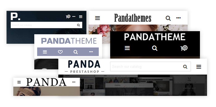
How to configure mobile bar like the picture below.
Check Panda template demo 4 on mobile view

Place items to the "Mobile bar bottom", items in there will have even width.
How to have a search box not an search icon on mobile header.

- Put the native "Search bar mod" item to mobile header.
- Set the "How to display search box on mobile header" to "An input file" in the "Search bar mod" module.


