What's New
- AuthorPosts

Hi,
1. Add the following code to the “Custom CSS Code”:@media only screen and (max-width: 991px){ #blockcart-modal .st_modal_close{right: 0;background: #000;} #blockcart-modal .products_slider{display:none;} #blockcart-modal .alert{paddng:.75rem 5px} }5. Add the following code:
#blockcart-modal .title_block_inner{font-size:15px;}
#blockcart-modal .swiper-button-tr{display:none;}
There is just one product on the popup, no subtotal to show out.
6. No, the icon will always there.
Best regards.
Hi,
1. I already added this code, hope it does not interfere:
@media (min-width: 992px){#blockcart-modal .modal-dialog {max-width: 600px;}}
a/ the popup is still not full width on mobile
b/ clicking the close button on mobile does nothing
c/ if the product name is longer, it will move below the image, can we make sure it stays next to the image and goes on another line?
d/ I moved alert-success to top, can you please give me code to change: padding, border-radius, color and border-color? We need to have the close button inside this alert box.
5. If you add more than one product, you can have subtotal and it will look much nicer on PC if it is same as on easycheckout as per my image earlier.Hi,
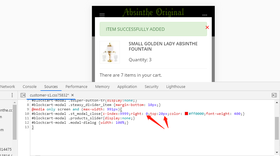
1. Add the following code to the “Custom CSS Code”:@media (max-width: 767px){#blockcart-modal .modal-dialog {width: 100%;}} #blockcart-modal .st_modal_close{z-index:9999;} #blockcart-modal .alert-success{background-color: #f00;border-color: #f00;color: #fff;border-radius: 50px;}Modify the modal.tpl file, add the col-3 and col-9 class, see attached screenshot.
5. Prestashop doesn’t assign the value to the shopping cart popup.
Best regards.Attachments:
Hi,
1. Add the following code:
a.#blockcart-modal .modal-content{margin: 0 10px;}
b. Add the top CSS and adjust the value for the top and right, see attached screenshot.
2. If you just want to change the icon only, use the following code:
.header_item i {color: #f00;}
3. Add the following code:
@media only screen and (max-width: 991px){.cart-grid-body a.btn{margin: 0 5%;display: block;}}
Best regards.Attachments:
Hi,
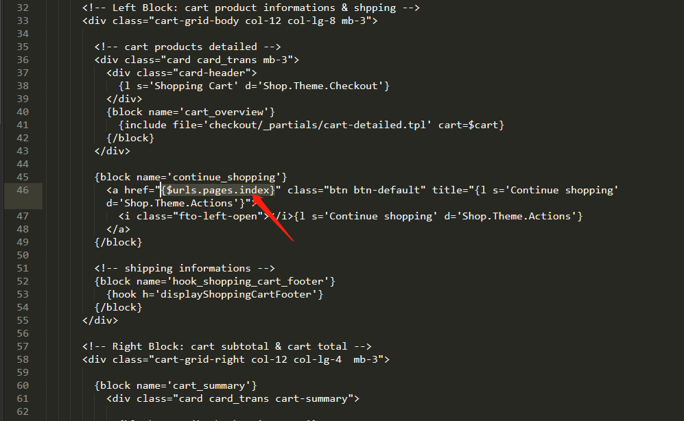
1a. Modify the \themes\transformer\templates\checkout\cart.tpl file, change{$urls.pages.index}tojavascript:history.go(-1);
1b. Use drop-down list isn’t friendly UE. user need to click the dropdown and select the quanty.
2. There isn’t a hook to transplant items after the menu block on mobile.
Best regards.Attachments:
Hi,
1a. perfect! I think that this should be a standard.
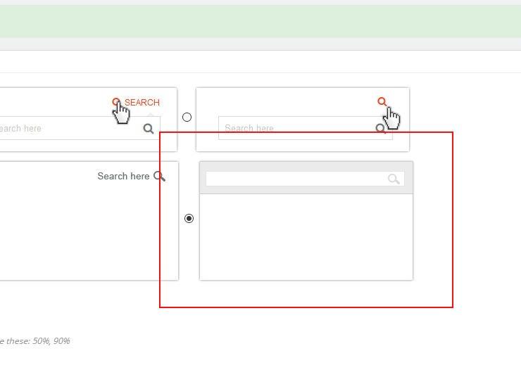
2. OK understood. I included a search mod to the mobile header, is it possible to have modal search similar to this and also similar to one you included for PC?
3. It looks like you did not manage to fix the “truncate category” issue in your latest 2.5.6 version. I have just upgraded, commented this code out `@media only screen and (min-width: 1081px){.truncate_cate_desc_1 .st_read_more {display: none;}}’ and as you can see on my test site, category description is truncated. It is also truncated if you select “NO” in settings. I was hoping that it will be fixed and no need for extra css.Hi,
2. I’m sorry I don’t understand… what demo site? I attach screenshot of your settings, is it possible on mobile with slow transition?Attachments:
Hi,
I didn’t see the form on the order confirmation page, see attached screenshot. would you like to add such a form? you can buy a 3rd party form builder module to help you achieve it.
Best regards.Attachments:
- AuthorPosts


You must be logged in to reply to this topic.