What's New
Tagged: header
- AuthorPosts

Hello there, I’ve been trying to set up a header similar to this one https://easybuilder.sunnytoo.com/bags/en/ but I had no luck..
When I add links menú to header module, it doesnt look as demo, I have tried several ways.. different % in columns, watching a lot of videos etc.. but no way.
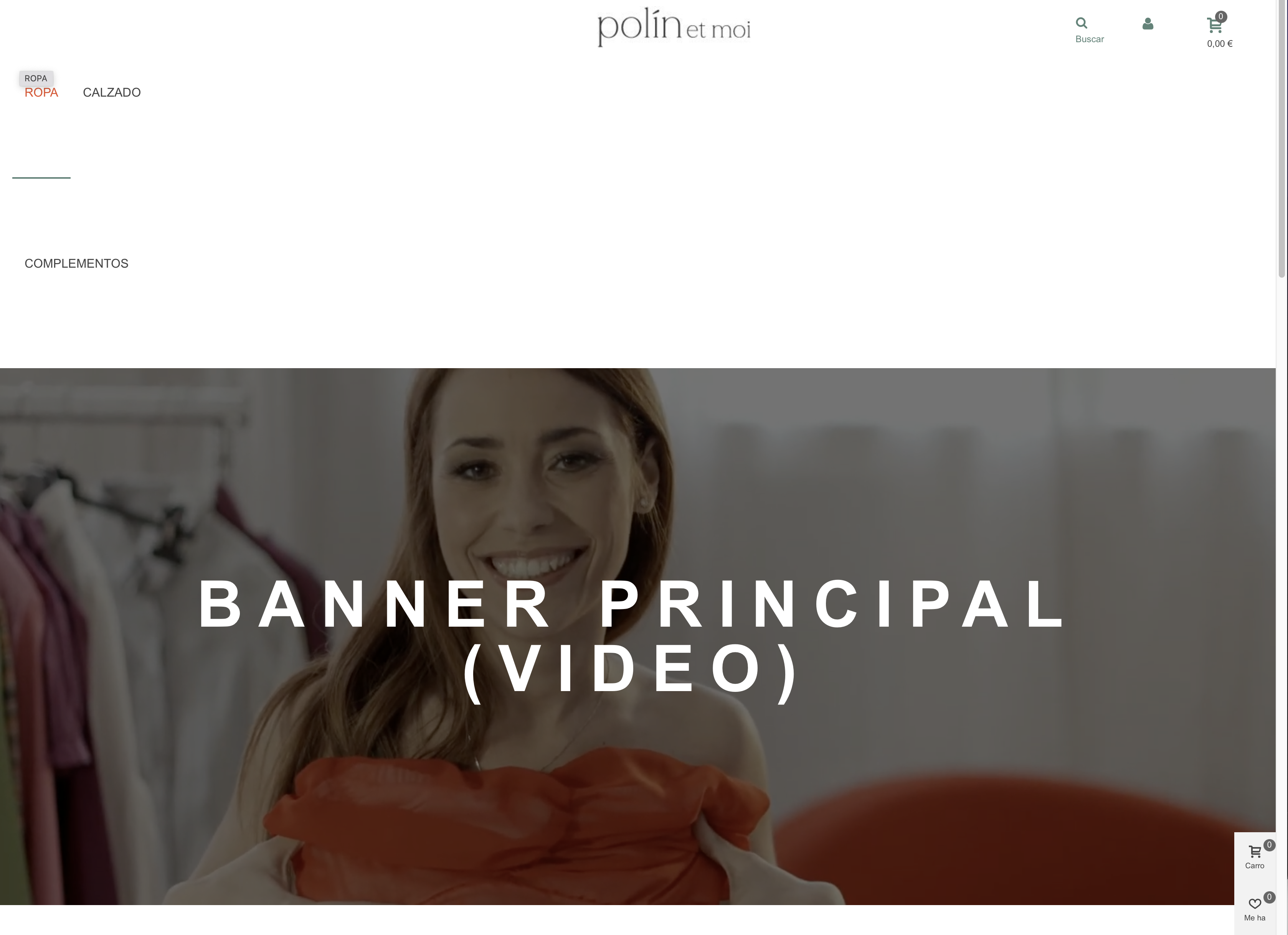
As you can see the first issue is the megamenú links. (It looks different if you change browser, in chrome is more less OK, but Links are not in same line as logo or the search, login, and cart buttons.
If you use Safari then it looks completely broken.)Second issue is: Search, login and cart buttons are way too separated, I have tried to reduce the gap but no luck.. how can this be done so it looks like header demo?
I’m using Panda Theme and easybuilder ( steasybuilder – v1.1.9 steasy_trans_panda – v1.1.7 Panda 2.6.9 )
Prestashop 1.7.8.2Hope you can help.
ThanksAttachments:

Hello there, almost everything sorted out but really time consuming.
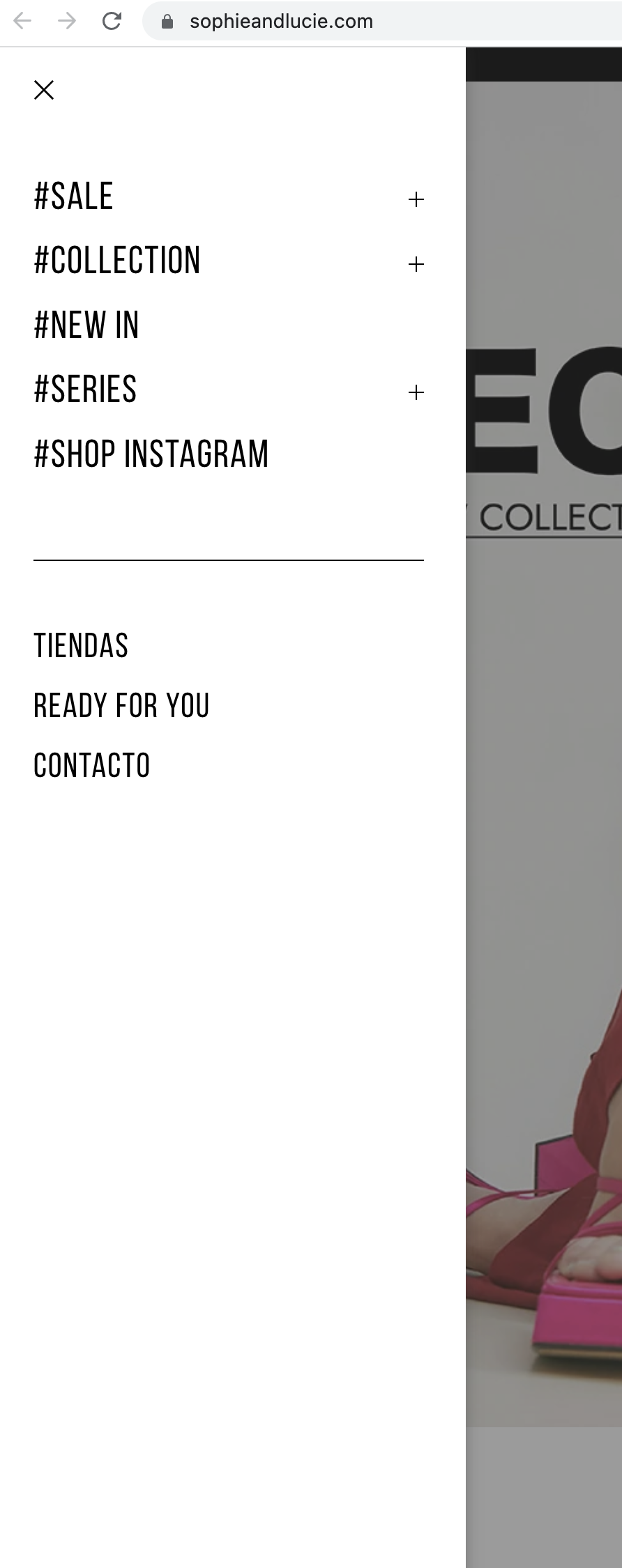
I’m trying to know if this kind of header is possible using Panda+ Easybuilder: https://www.sophieandlucie.com/
Is it possible? (Transparent header on top, sticky header with different background color when scrolling, and the left bar menú) Also in mobile. I have seen a similar example, but don’t know how to create it with the documentation I’ve found.
Hope you can help me out!
Thanks.Yes, it’s possible.
1. Enable the “fixed header” feature, set the opacity of its background to 0 to make it be transparent.
2. Set a white background to the sticky header.Speaking of the menu, you can have one like this https://easybuilder.sunnytoo.com/electronics/en/
If you like to have the exact same one, I can guide you to create a button to open the mobile menu, like the attached 2808-
This reply was modified Feb '22 by
 Jonny.
Thanks for your answer again Jonny.
I have followed your instructions and header is a bit closer, but not quite similar to the example I shared.
Is it possible to do this in Pandatheme?:
– Menu items text, link hover color and cart, search, etc.. icons can only be set in one color, so with transparent background I will hardly see the items, ideally it would work if we could set a color for transparent header and another color for the sticky white header (So we can have texts and icons in white in transparent background and then have them black in the white header while you scroll.)– Same issue with store logo, as I we can only have one store logo version, I will lose logo with the transparent background. Ideally we should have a white logo on top with transparent background and then when you start scrolling, logo will switch to dark color.
You can see this example: https://www.sophieandlucie.com/ or this other example: https://www.bimani.com/
Regarding the menú: I have seen your option and that is the idea we would like, just change a bit the look and feel, is that possible so it looks like this example menú? (All white with dark text and without the grey top bar) Like this example: https://www.sophieandlucie.com/
thanks again in advance, Best!
Attachments:
1. I once thought about that, but no perfect solution set two different colors for every element in the header, since the header of Panda theme has unlimited possibilities, not like the headers on those two demos, they are simple.
If you do want your site to be the same as those two demos, let me know, I will create a piece of custom css code for you to achieve that.
2. Use this custom css code.#side_stmobilemenu .st-menu-title{display:none;} #side_stmobilemenu .close_right_side{position:static;color:#777;display:inline-block;font-size:18px;padding:10px;} #side_stmobilemenu .fto-angle-double-left:before{content: "\E849";}Thanks again for the answer,
Thanks for the code, now the mobile menu looks much better. Is there a way to make same look and feel for menú in the right? (Login, Language and currency)
As for making my site same as example I sent you, if you could send me a custom css code to achieve, it would be great. (Example: https://www.sophieandlucie.com/ )
Thanks!
Please check your site. I’ve added some css code to achieve what you wanted.
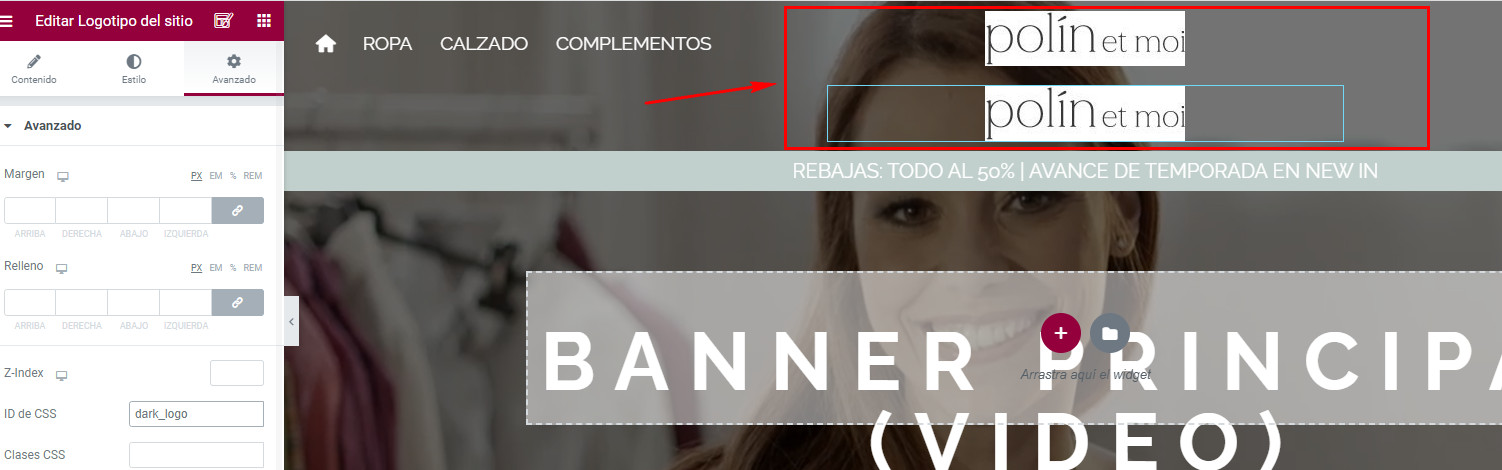
See attached pic, there are two logos, they should be in png format with transparent background, one of them should be in white, the other should be in black.-
This reply was modified Feb '22 by Jonny.
Attachments:
Thank you Jonny, but I can only see one logo in header to edit..
How can I Change second logo image?
Also, right now if you navigate outside homepage then we see first header in white is active, but for example in product page it makes difficult to navigate as background is white too: https://b2b.polinetmoi.com/inicio/11-38-abrigo-guateado-morgan.html#/3-tallas-s/23-colores-kaki
Can we use dark header for all other pages than home?
Thanks!-
This reply was modified Feb '22 by javier1.
1. See attached pic, you can edit the second one there.
2. I’ve changed the color to black for other pages.
Attachments:
Thanks again for your help Jonny,
Quick questions with this:
– I have changed dark logo because it was low quality and now in other pages it doesnt appear. Where should we control this? (So I dont have to bother you 🙂 )Now I have correct final logos, but our issue is: in mobile/tablet our logos look huge. I have not found a way to adjust this to make mobile/tablet logo a normal size as it is shown on desktop. How could we do that?
Thanks again!
Fixed.
Here is all the code
.st-menu .st-menu-title{display:none;}
.open_bar_right .st-menu .st-menu-header{text-align:right;}
.st-menu .close_right_side{position:static;color:#777;display:inline-block;font-size:18px;padding:10px;}
.st-menu .fto-angle-double-left:before, .st-menu .fto-angle-double-right:before{content: "\E849";}
.popsearch{z-index:102;}
.elementor-4 .elementor-element.elementor-element-1ad1e5d:hover, .stuck .elementor-4 .elementor-element.elementor-element-1ad1e5d{background:#fff;}
#index .elementor-4 .elementor-element.elementor-element-1ad1e5d .top_bar_item .header_item, #index .elementor-4 .elementor-element.elementor-element-1ad1e5d #st_mega_menu_wrap .ma_level_0{color:#ffffff;}
#index .elementor-4 .elementor-element.elementor-element-1ad1e5d:hover .top_bar_item .header_item, #index .elementor-4 .elementor-element.elementor-element-1ad1e5d:hover #st_mega_menu_wrap .ma_level_0,#index .stuck .elementor-4 .elementor-element.elementor-element-1ad1e5d .top_bar_item .header_item, #index .stuck .elementor-4 .elementor-element.elementor-element-1ad1e5d #st_mega_menu_wrap .ma_level_0{color:#000000;}
#light_logo{display:none;}
#index .elementor-4 .elementor-element.elementor-element-1ad1e5d #light_logo{display:block;}
#index .elementor-4 .elementor-element.elementor-element-1ad1e5d #dark_logo{display:none;}
#index .elementor-4 .elementor-element.elementor-element-1ad1e5d:hover #light_logo, #index .stuck .elementor-4 .elementor-element.elementor-element-1ad1e5d #light_logo{display:none;}
#index .elementor-4 .elementor-element.elementor-element-1ad1e5d:hover #dark_logo, #index .stuck .elementor-4 .elementor-element.elementor-element-1ad1e5d #dark_logo{display:block;}
See attached pic, you can set the width of the mobile log there. You can even upload a logo specifically for mobile devices there.
-
This reply was modified Feb '22 by Jonny.
Attachments:

Hi,
Could you enable the account so I can take a look at it?
Best regards.Attachments:
Hi,
Please add the following code to the “Custom CSS Code”:
.userinfo_mod_top{display:inline-block;}
You need to remove the empty block, as there is enough space to show all items on the last block.
Best regards.Attachments:
- AuthorPosts


You must be logged in to reply to this topic.