What's New
Viewing 4 posts - 1 through 4 (of 4 total)
Viewing 4 posts - 1 through 4 (of 4 total)
You must be logged in to reply to this topic.
Hello. I’ve recently purchased your Transformer template and i’m discovering all the possibilities. But i’d like to know if there’s a way to use the left sidebar that is used in mobile interface in a desktop intercace without selecting “use mobile header always”.
The reason i want it is because the header in desktop version has more custom features than mobile one, and if i select “always use mobile header”, there’s a lot of wasted space when i use a bigger screen, because it has to fit the same modules in desktop and in mobile (for example, i want to use a different logo in low px screens and in tablet and higher screens).
This website is a good example of what i want: pccomponentes.com
Look that if you reduce the size of the screen, it change Between desktop and mobile header, but always keep the sidebar menu for categories.
Hope my explanation was specific. Thank you very much and best regards!
Hi,
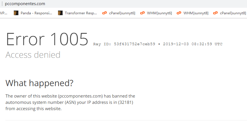
I can’t access your reference site, see attached screenshot.
Best regards.
Hi:
I’ve recorded a video to show what I mean. In desktop and mobile mode, they show the sidebar menu. Is that possible in Transformer?
I have to use the “Always use the mobile header” option If I want to be able to use the sidebar menu, but if I use the desktop header, can’t use the sidebar menú. Maybe transplanting a module I could?
Thank you very much. Best regards.
You must be logged in to reply to this topic.