What's New
Viewing 10 posts - 1 through 10 (of 10 total)

Viewing 10 posts - 1 through 10 (of 10 total)
You must be logged in to reply to this topic.
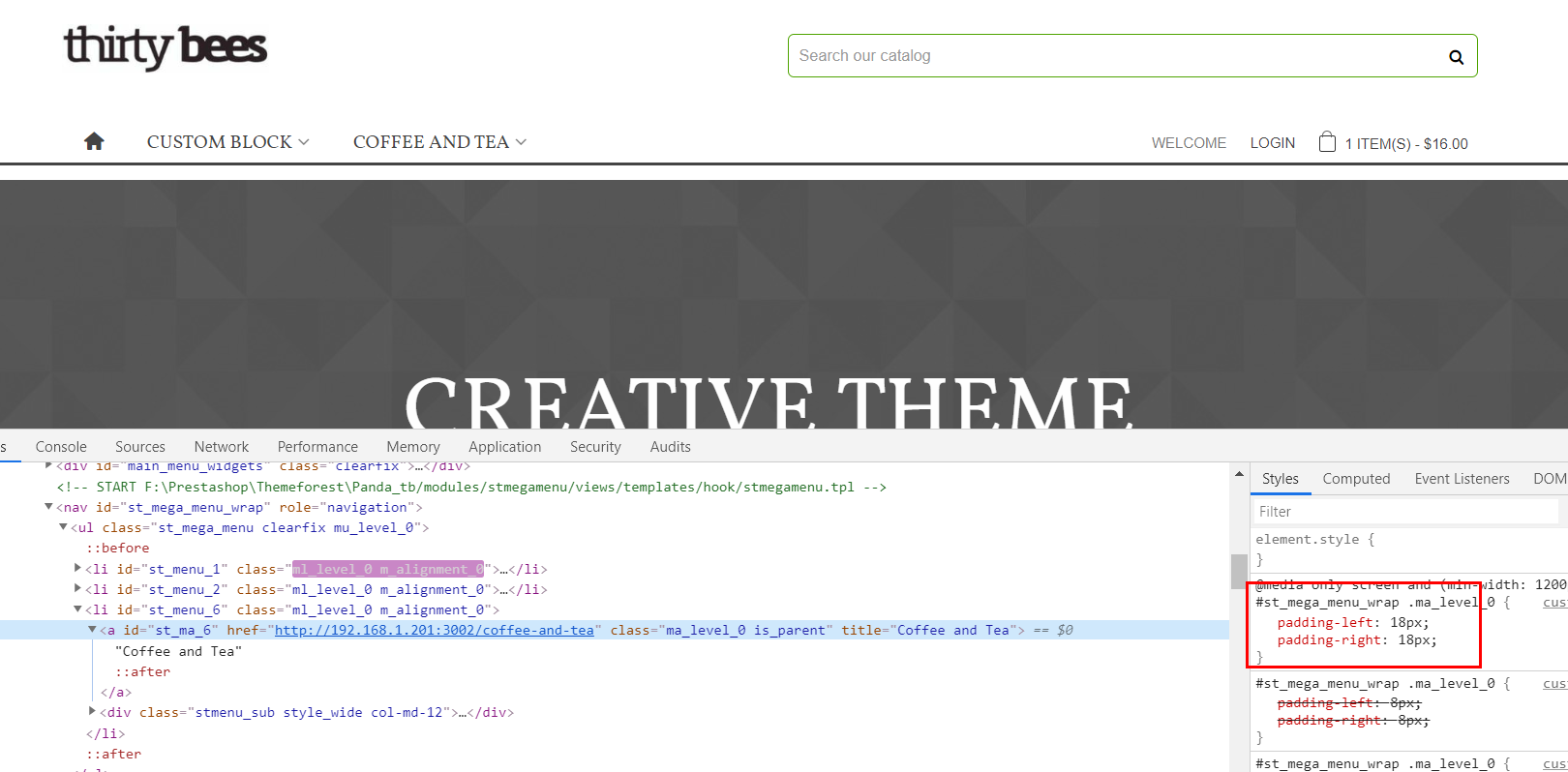
I am using 1440 pix page width. With full HD browser screen resolution megamenu is shown in a proper way – in one line. But on screens with resolution lower that 1140 the menu is shown in 2 lines instead of being resized into one line. See screenshot. The same is for sticky menu.
Panda Theme 1.4.2 at Thirty Bees 1.0.7
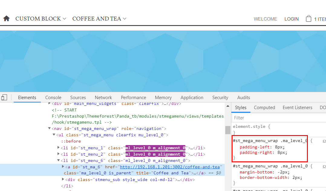
Put this code to the Custom css code field in the Theme editor module to decrease the space between menu items to make them be in one line.
#st_mega_menu_wrap .ma_level_0{padding-left:5px;padding-right:5px;}
@media only screen and (min-width:1200px){#st_mega_menu_wrap .ma_level_0{padding-left:16px;padding-right:16px;}}
I will add an option for that in next theme update.
You can also try to reduce the font size of menu item or using a narrower font.
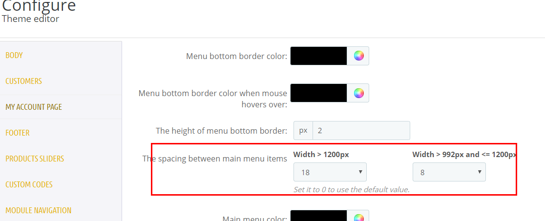
Hi, I filled both fields, but the last one (width > 992px and <= 1200px) is always applied for me regardless of browser resolution (I just changed browser window size from big one to medium or small). Is it not linked to the current browser resolution, or just to hardware screen resolution, which is constant?
Sounds like a cache related issue, press ctr+f5 to force loading the latest content.
See attached pics, I did a test on my local, they worked as expected.
You must be logged in to reply to this topic.