What's New
- AuthorPosts

Hello.
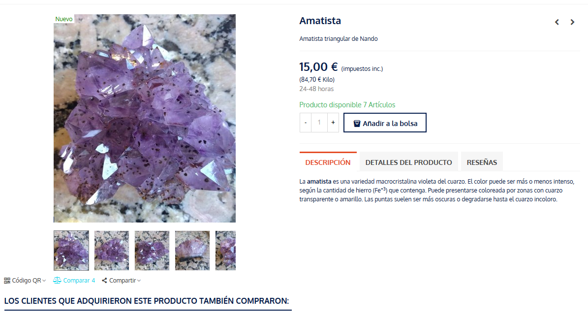
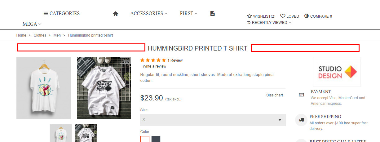
I would like to setup my product page with an arrangement similar to that of the following link:
https://www.mukhas.com/es/equilibrio-y-armonia/8-shanti-chakra-mala.html1. Product name above centered
2. Image on the left
3. Description tabs, product details, reviews, etc. on the middle Top
4. The other elements under the product Tabs (price, available units, etc.)
5. The add to cart button should be the last item in the right columnI have modified:
BO / theme and logo / select design / product according to Capturar-1.jpg
BO / Theme editor / product pages according to Capturar-2.jpg and Capturar-3.jpgSo long I have gotten this close as shown in Capturar-4.jpg
I would also like to align the elements at the bottom of the image with the left alignment
of the image (QR Code Compare4 Share). See Capturar-4.jpg
I have searched the Panda2 demos but I have not found any with the product tabs
top right of the image.
Sorry if there are too many questions.
Kind regards and thanks very much.
PD: PS 1.7.6.4
TE 2.5.2
You’ve to some customizations.
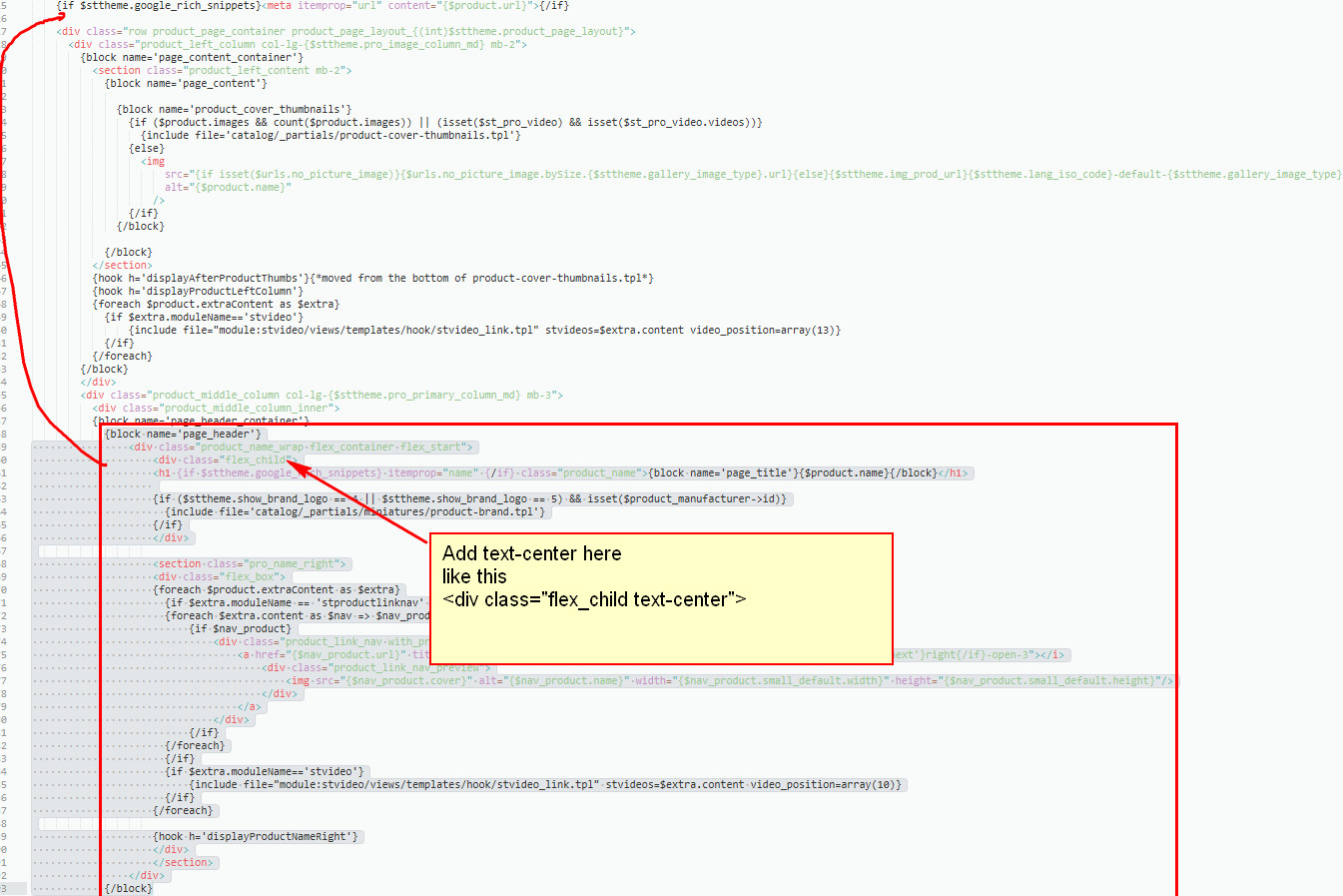
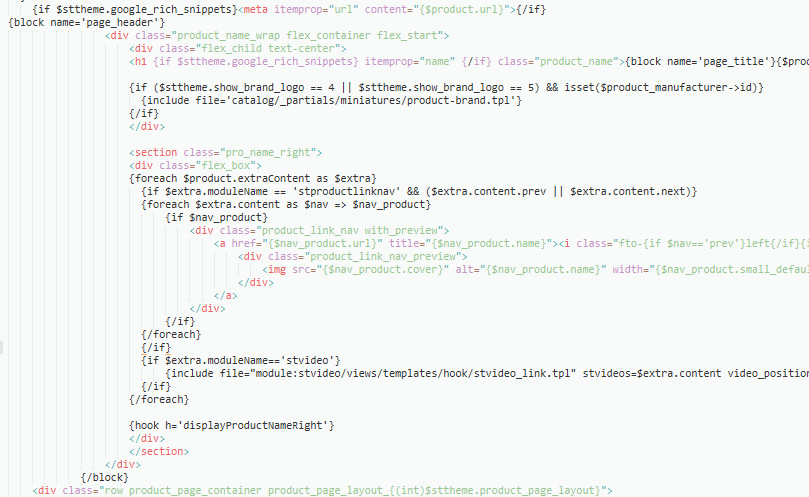
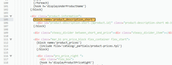
1. Edit the \themes\panda\templates\catalog\product\product-first.tpl file, see attached 1438.
3. Also the product-first.tpl file, see attached 1439, move that line up to somewhere near this line
{block name=’product_description_short’}Let me know if you need more help.
Attachments:
Hello,
thanks for your answer.
About point 1 I like to have product’s name on top of both, image (left column) and center column (description, cart, tabs) like here:
https://www.mukhas.com/es/equilibrio-y-armonia/8-shanti-chakra-mala.html
image 1438 set product’s name on the middle top of center column. Can you help with this please.Image 1439 (point 3) refering to tabs position is missing. Can you post it a gain please.
Thank you very much.1. See attached 1446 and 1445, the solution I gave you can work.
2. See attached 1447 and 1439.
I can help you with the modification, I need a ftp access.
Hi.
Following the adjustments on the product’s page it would be possible:1. That when hover the mouse on the thumbnail the main image would change instead of how it is now that you have to click?
2. Change the font type and size in the product’s tabs (description, etc.) regardless of the global font and size settings
3a. Add a fine line around the tab and active text as shown here: https://www.mukhas.com/es/equilibrio-y-armonia/8-shanti-chakra-mala.html
3b. Change the behavior of the titles of the tabs so that they look the same as on this page: https://www.mukhas.com/es/equilibrio-y-armonia/8-shanti-chakra-mala.htmlThanks in advance!
Hello, thanks for your help.
“.product_info_tabs .tab-pane-body{font-size:16px;}”
This works for me and its ok but only for the font size on the content of the tab.
Is it possible to do the same for the titles of the tabs and change the font type too in both of them (title and content)?“3a,3b, Change sttab_2_2 to sttab_2_1 in the \themes\panda\templates\catalog\_partials\product-tabs.tpl file.”
Did not see any change once done the the above modification. Thanks anyway.I wish to add/remove descriptio/short description in the quick view of product.
Probably I prefer the description instead short description.
Is it posible pleasse?
Many thanks again!2. This is for the titles.
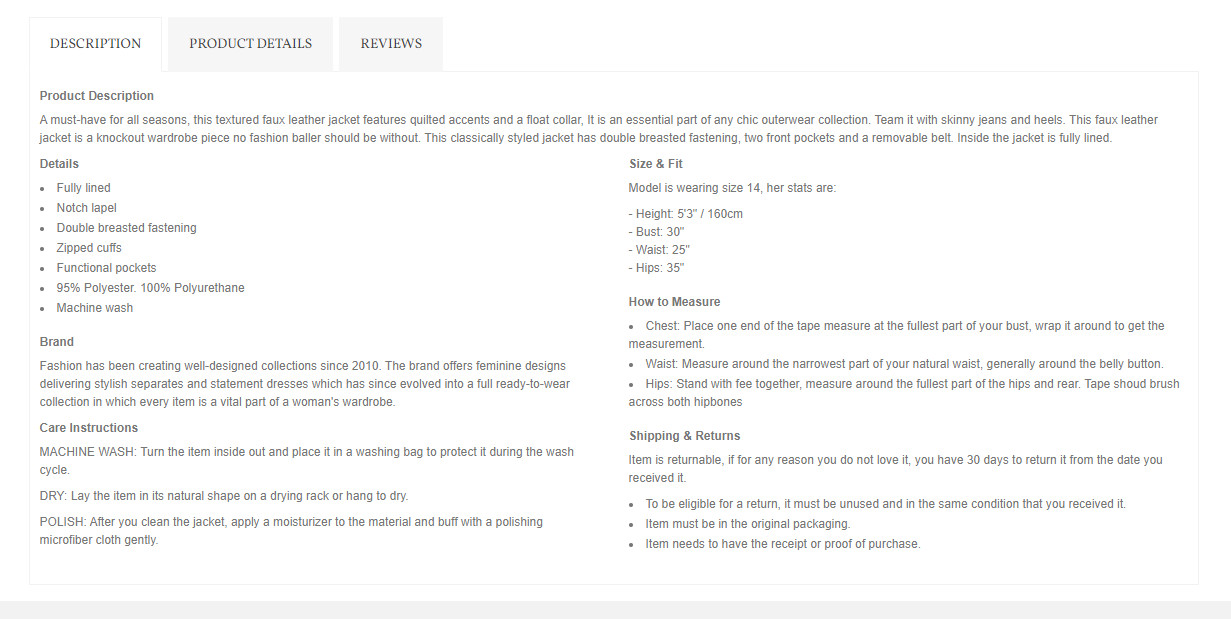
.product_info_tabs .nav-tabs .nav-link{font-size:16px;}3. Did you clear the Smarty cache. See attached pic, that’s how the tab would look like after applying the modification.
4. Replace this code {$product.description_short nofilter} in the \themes\panda\templates\catalog\_partials\quickview.tpl file with {$product.description nofilter}
Attachments:
Hello..
all working great now!!!
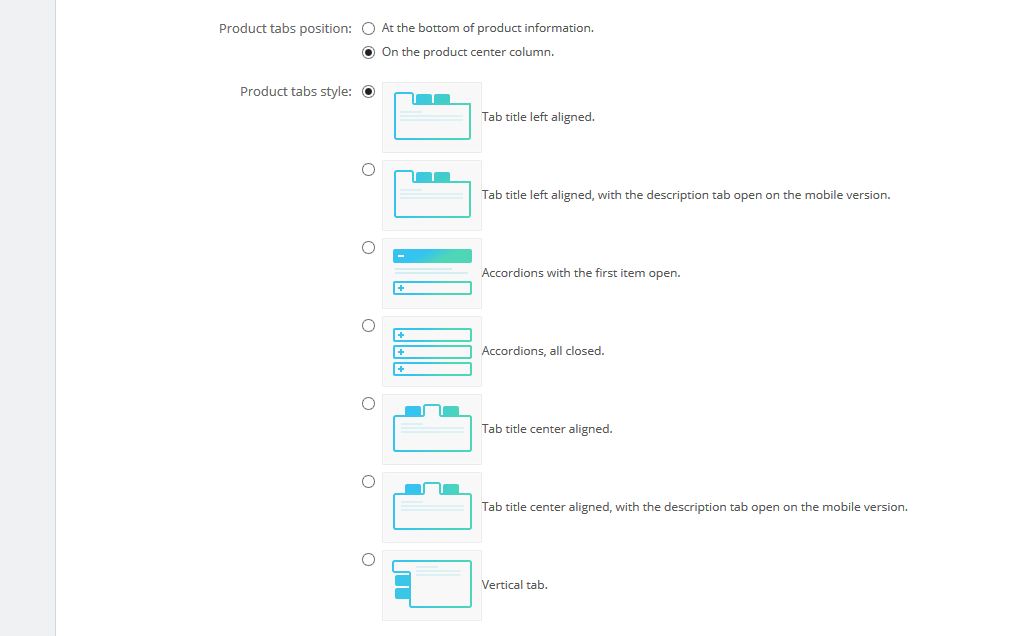
About de the mods on “Change sttab_2_2 to sttab_2_1 in the \themes\panda\templates\catalog\_partials\product-tabs.tpl file.”It seems not to work when in Theme editor/product page the setting for the tab is:
Tab title center aligned, with the description tab open on the mobile version.
I moved to:
Tab title left aligned.And all ok.
Thks a lot!!Hi.
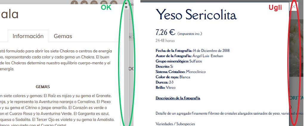
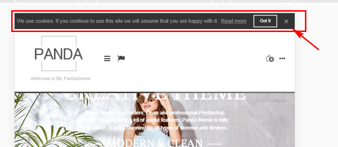
I have some doubts and more queries that I would like you to help me to solve please. Thanks in advance for your help.1. In the quick view of product I would like to change the style as seen in the image Image1.jpg marked as “ok” instead
than the one marked “ugly”. I mean the external position of the “X” that is used to close the window and the side scroll bar
since in the “ugly” scroll bar does not appear.
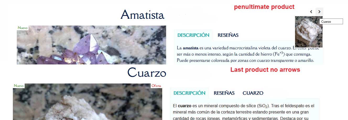
2. On the product’s page when the last product is reached using the product scroll arrows the prev and next arrows
disappear making it impossible to return to the previous product.
This happens on both desktop and mobile devices. I have a look at your demos and it’s ok there.
See Image2.jpg
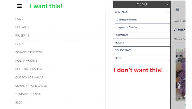
3. How can I make the megamenu on mobile devices look like the left image instead of the right one on Image3.jpg.
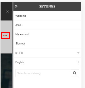
4. How can I make the elements (not necessarily all) shown in Image4.jpg visible in the same position (above the logo) in
mobile devices
5. Can I use Panda2 for local testing or is there a restriction?Thank you very much for your help.
A cordial greeting.Attachments:
Hi,
1. Use this custom css code
.st_modal_close{z-index:1;right:0;}
2. 1481 I tested on my site, I don’t have the back arrow button disappearing issue. Are you using a module to remove ids from urls?
3. you can achieve something similar, not the same. See attached 1478, the only way for people to close the menu is to click on the left arrow, that’s not good, do you still want to do this.
4. See attached 1476, those content will be shown in a sidebar on mobile. If you want to show something above the mobile header, see attached 1477, you can use the advanced custom content module to achieve that, see 1479
5. Put the local dev site in maintenance mode, more info here https://www.sunnytoo.com/license-policyAttachments:
Hello,
.st_modal_close{z-index:1;right:0;} –> better look but no scroll bar at the right. Is it possible to have one?2. 1481 I tested on my site, I don’t have the back arrow button disappearing issue. Are you using a module to remove ids from urls? –> I only have Prestashop and Panda2 modules as long as I know
Additional modules I have: Croos selling, redsys, packlink, revoluition slider, visual composser, correos express. Any idea?.3. you can achieve something similar, not the same. See attached 1478, the only way for people to close the menu is to click on the left arrow, that’s not good, do you still want to do this. –> Send me the instructions and let me test if you don’t main as now it’s almost the same. I want this only for mobile devices.
4. See attached 1476, those content will be shown in a sidebar on mobile. If you want to show something above the mobile header, see attached 1477, you can use the advanced custom content module to achieve that, see 1479 –> Works great!!!5. Put the local dev site in maintenance mode, more info here https://www.sunnytoo.com/license-policy –> Great!
Thanks!!!
1. See attached 1486, a scroll bar will occur on the right side, which is better than a scroll bar on the popup window.
2. I need to access to your site to check, send me your site back office and FTP login details.
3. Set the “Sidebar transition” setting to “Slide in on top” in the Sidebar module. Put this code to the custom css code field.
#side_stmobilemenu {right: 0;width: auto;border-right: 0;}Attachments:
Hello,
1. See attached 1486, a scroll bar will occur on the right side, which is better than a scroll bar on the popup window. –> I missed that one. Looks good!!
3. Set the “Sidebar transition” setting to “Slide in on top” in the Sidebar module. Put this code to the custom css code field.
#side_stmobilemenu {right: 0;width: auto;border-right: 0;} –> much better for me. Is it possible to do the same about the right side menu (Settings)?
Thak you very much!1. I’ve added a piece of css code to the theme editor to make the right side menu have the same effect.
2. You didn’t install the category tree module to remember the last visited category, that’s why the arrows disappeared when you were on a product whose default category is different that others. I installed module called “Last visited category” to fix the issue for you.About the css code added…. probably we stick with your first proposal
#side_stmobilemenu {right: 0;width: auto;border-right: 0;}
instead
#side_stmobilemenu {right: 0!important;width: auto;border-right: 0;}
for both Menu and Settings as the user may close menu touching the main page. Good staff anyway!
Category tree module: No idea about that behavior.
I had already installed “Enlaces del árbol de categorías” wich I think it’s the same module.
May be the problem I was I disabled module “Búsqueda por facetas” and remove category tree display on the left for category’s page?
Thanks- AuthorPosts


You must be logged in to reply to this topic.