What's New
Viewing 2 posts - 1 through 2 (of 2 total)


Viewing 2 posts - 1 through 2 (of 2 total)
You must be logged in to reply to this topic.
Tagged: padelsuite@gmail.com
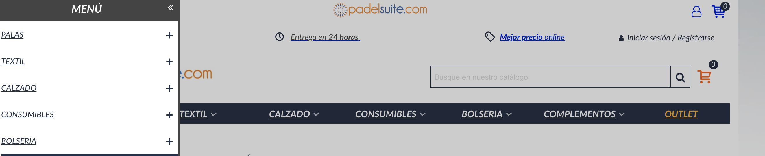
Hello, this is what the seo boy sends me, to see if it can be solved,
As seen in the images, the hamburger menu is hidden for the computer version. It contains the label display: none, that what you do is hide visually.
In the eyes of Google, it is a hidden element but he does read it, in fact, if the cache test is done: https: //www.padelsuite.com/palas-adidas, you can check how the main menu appears 2 times in the source code. Once for the computer menu, and once for the mobile menu.
The ideal is not to hide any element with display none (neither menus, nor links, nor text, since Google can penalize it), the ideal is to replace one menu with another.
Hello,
Thanks for your information. It’s a common way for responsive sites to use two menus, one for mobile, another for desktop, they can be different menus, but in most case, most of their menu items are the same.
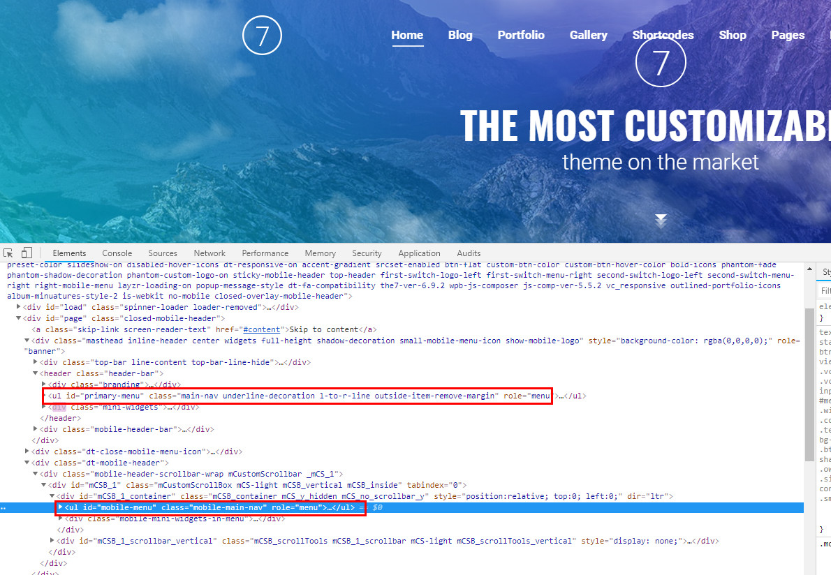
Check the attached screenshots, they are the most popular responsive sites, they do use two menus, till now we did’t find any google official documents saying that’s not okay.
Transformer theme has a feature in the Theme editor to show mobile menu for all mobile devices, even if they are wider that 992px, if you are okay with the feature and you are really care about menu appearing twice, I can guide you to modify files to show one menu only. If your SEO boy can let me know disadvantages of showing menu twice, I can include modifications in next theme update.
Regards,
Jonny
You must be logged in to reply to this topic.